
Understanding CSS The Language of Web Design
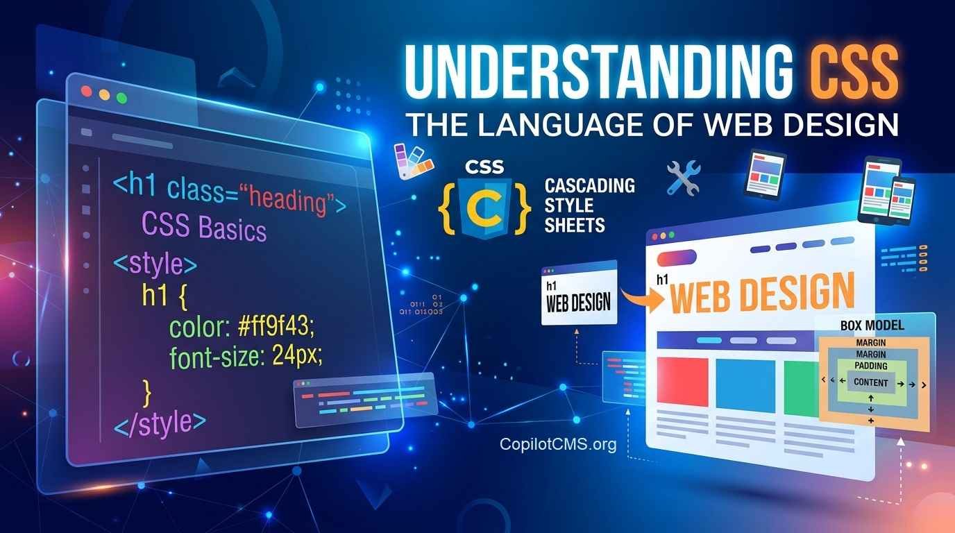
Cascading Style Sheets (CSS) is the fundamental technology used to format, lay out, and design web pages. While HTML provides the structural skeleton of a webpage, CSS controls its visual appearance—including colors, typography, layout structures, and responsive adaptations for different device screens.
What is CSS and Why is it Used?
CSS separates web content from visual presentation. This separation offers several key advantages:
- Maintainability: Update styles across an entire website by editing a single stylesheet.
- Performance: Browser caching reduces load times by reusing the same CSS file across multiple pages.
- Flexibility: Adapt layouts dynamically using responsive design techniques like Media Queries.
Basic Syntax and Rule Sets
A CSS rule set consists of a selector and a declaration block. Declarations contain key-value pairs of properties and values separated by colons and terminated with semicolons.
/* Selector targeting all h1 elements */
h1 {
  color: #2c3e50;
  font-size: 2.5rem;
  margin-bottom: 1rem;
}
Methods of Applying CSS
CSS can be added to HTML documents in three ways:
- External Stylesheet: Linked using the
<link>tag inside the HTML<head>. (Best practice) - Internal Stylesheet: Written inside a
<style>element within the HTML document. - Inline Styles: Applied directly to elements using the
styleattribute. (Not recommended for scalable projects)
Core Concepts
1. The Box Model
Every element rendered on a webpage is treated as a rectangular box. The CSS Box Model dictates how element dimensions are calculated.
- Content: The actual text, image, or media container.
- Padding: Transparent space surrounding the content inside the border.
- Border: The frame surrounding the padding.
- Margin: Transparent space outside the border separating the element from adjacent elements.
2. Specificity and the Cascade
The term Cascading refers to how browsers resolve conflicting styles. Styles cascade based on order of appearance, inheritance, and selector specificity (Inline styles > IDs > Classes/Attributes > Elements).
3. Layout Modules
Modern CSS relies primarily on two main layout systems:
- Flexbox (Flexible Box Layout): Optimized for one-dimensional layouts along a single axis (row or column).
- CSS Grid Layout: Optimized for complex two-dimensional layouts using explicit rows and columns.
Modern CSS Features
Modern web development utilizes features that significantly expand native capabilities:
- CSS Custom Properties (Variables): Store reusable values natively (e.g.,
--primary-color: #3498db;). - Media Queries: Conditional styling rules applied based on viewports, hardware capability, or user preferences (e.g., light/dark mode).
- Pseudo-classes and Pseudo-elements: Select elements based on state (e.g.,
:hover,:focus) or target specific sub-parts (e.g.,::before,::after).